25. July 2015 · Comments Off on What Makes a Powerful Photo? · Categories: Philosophy, Photography · Tags: , ,

I was pondering what makes a powerful photo? I was reflection on my photos from over the years some of which are here, others on my site (PLP), and found that the memorable, powerful photos were those that evoke strong emotions, even after years.

The cover image with the beam of light is a classic, almost cliche image, none the less it still has that strong sense of ‘let there be light’ of bringing light into our dark interiors.  When I took the photo, I was not thinking of what feelings the scene evoked in me.  Just that there was something (unknown at the time to me) that made that image the one to get.

The image below I found disturbing, and still do after all these years. It evokes my reaction to slavery, which in this case has a double meaning of a black man posing with number tag for bidding, and a person who is a slave to their body image. I would not hang this picture any place for a long time because I found it so disturbing, now it sits above my desk at work. What is your reaction to the photo?  When I took the photo, again, I did not know what it was in that instant that called to me, rather just something that said ‘I want this image’.  It wasn’t until I saw it in the digital darkroom that the impact of the image hit me.

A powerful photo of slavery

Slavery


The picture below is from the opposite extreme. It is a powerful photo because of the sense that I have a stairway to heaven.  I have always had a fascination with reflections and so when I saw this initially I had to have the photo and knew that it was a powerful photo.  Just how powerful I did not grasp until I saw the final result.

A powerful photo appealing to our spiritual nature

Stairway to heaven


The Camp Wolverton sign, based off to the camp patch brings up strong feelings in me, and so is a powerful image for me, but unless you were a camp staff or camper you find it a very ho hum photo.  I include this photo to illustrate that a powerful photo may depend on the context of the viewer.   Some contexts may be more universal than others; how many Instagram photos are there of a meal? Those meal images are captured because of the feelings associated at the time, but 5 years or 10 years from now, what feelings will be associated with that Instagram pic?

Camp Wolverton, BSA

A powerful photo for me, but not a universally powerful photo

Along these same lines are baby pictures.  How many times has an excited person wanted to show you baby pics that you find ho hum at best?  Well I now find myself on the other side of that conversation as a very proud grand pa ! I have lots of pic that show my wonderful baby grand daughter, would you like to see them?  The point again is that they are powerful photos for me, but other than the family I would be surprised if anyone else is particularly moved by them.


It is probably too much to ask that we know what the feeling is of an image before we capture it, however, it is certainly a question we should ask ourselves as we review our images.  What is it that makes a powerful photo?

  • Composition helps, but all composition doesn’t cut it by itself
  • The subject matter is part of it
  • and the unknown rest of what goes into an image.
18. July 2015 · Comments Off on In Naiveness all things look simple; even in photography · Categories: Mental Process, Philosophy, Practice, Preparation · Tags: , , , ,
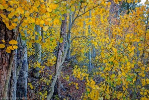
Random chaos & order - It was my naiveness that let me do fall colors the first time without a place to stay

Random chaos & order

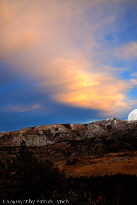
Sunset, Moon rise. Planning, not naiveness let's us be at the right place at the right timeAs a kid, I read Tom Swift books.  In these he invented all sorts of very reasonable sounding incredible inventions.  I kept wondering if he could do them in the books, why were they not actually invented yet, seemed simple enough in the books…  The naiveness of a child.  How does my naiveness show up today, or where or when do I choose not to be prepared?

Over the years, I have learned, that if things looked simple and had not yet been done, that I was probably naive.  It would be a call for me to dig into what was the reality.

The mass marketing of photography plays to this. ‘It is simple to get a great photo,  just buy the latest technology and hold your finger down on the button until the great photo shows up.’   True, higher end stores like Keeble & Shuchat have a book section, but even many of these seem to promise ‘if only you did this’ you would have great photos.

But the truth is, there is a lot to consistently (as opposed to an occasional lucky shot) getting good (and sometimes great) photos.  Yes, lucky is good, but ” Chance favors only the prepared mind” is still true today, otherwise it is just random chance.

What is the ‘prepared mind’? what do we need to do for ourselves to improve our photos?  Let’s look at some of the things that go into a typical good photo.

  • The photo is sharp (not usually fuzzy).  So technology can help here, if it is used appropriately.
    •  We can use a tripod
    • We can use image stabilization
    • We can use faster shutter speed (what are we trading off for this?)
    •  Do we have the picture focused on the right thing, or are we focusing on the wrong point…?
  • Is the image lit correctly? Do I have the correct exposure?
    • Cameras today have built in exposure systems that are very good at generating snapshot like images.  However, if you want a dramatic image, then you might have to understand lighting; low angle light vs overhead light, or flat even light vs. hard light, or the color of the light (before or after sunrise, or mid day).
  • Composition – There are so many things here, and there is not nearly the help from technology that there are for sharpness and exposure.
    • Do I really want the subject dead center, or do I want it some place else?
    • Remember rule of thirds
    • Don’t put the horizon on the mid line
    • Make sure that there is not ‘extra’ in the photo
      • No strong lines coming out of someone’s head
      • No extraneous lines that are not contributing (twigs, branches, arms…)
      • Make sure that borders and corners are clean and are not distracting
    • Are you or can you frame the photo?
    • Do the lines lead you into the photo?
    • Is the expression on the face  the expression you want? (or is their mouth open?)
    • … and the list goes on ….

And if you can do all of the above in the 2 seconds that you bring the camera to your eye and snap, you are a better person than I.

What is a prepared mind with regard to photography?  For me, and folks that I work with it means that we practice evaluating photos to see what works and what doesn’t work in photos.  We practice enough that looking at a photo on the screen or in the camera or in magazines, until it is second nature to figure out what works and what doesn’t work.  Where does naiveness show up in your photography?

So, we can try and practice with our own photos, but I have found that usually doesn’t work very well, particularly for learning in the beginning.  What I have found works much better is to practice with other people’s photos.   I strongly recommend that you get yourself an account on 500px .  Then force yourself to write reviews of photos.  Having to write a review forces you to evaluate the photo and what works and does not work in it.   After a few hundred reviews you will understand what sorts of things work in photos and what does not.  This is the practice that creates the prepared mind.  And now, taking good photos is not so naively simple.

Oh, and remember,

HAVE FUN

PLP


11. July 2015 · Comments Off on Cropping – The Big Win · Categories: Composition, processing photos · Tags: , ,
Before Cropping

Before Cropping

Cropping is usually the single biggest impact operation on a photo to improve it, though not always.  The general rule is do biggest impact global changes first, and local changes later.  Sometimes exposure may trump cropping.  In the leading image it is a toss up as to whether cropping or exposure needs to be address first.  Below are a set of samples that show different types of cropping and exposure changes that lead to the finished image.

As can be seen it looks interesting but it is over exposed and the surfer is up in the corner. How can cropping help this?

Adobe’s Lightroom(LR), has several built in guides that represent classic composition guidelines.  These include:

  • Rule of Thirds
  • Diagonals
  • Magic Triangles (my name)
  • Golden Mean (modified thirds)
  • Golden Spiral
Before Cropping w/ exposure corrected

Before Cropping w/ exposure corrected

These overlays are helpful guides to use when trying out various crops on a photo.  Below are examples of the crops. Before cropping, I made some exposure changes to make the photo easier to work with as seen here. The guides should have the guide lines match lines in the photo and have guide line intersections at points of interest in the photo.

Now there is a little more definition in the shape of the wave, and we can see that it makes a nice leading line as well as framing the surfer.  Its just not at an interesting place in the photo, so we try cropping it  to make it look better.  Notice the sliders over on the right that were diddled with; Exposure, Contrast, Highlights, Whites to improve the appearance.

One take on cropping on a third

One take on cropping on a third

Below is a first guess at using the rule of thirds for cropping. The surfer’s eyes are on a third line and so is his body.  But, the nice line of the wave is lost.

So, a second possible crop with thirds is cropping more off the bottom to bring the bottom third line up.  This looks interesting, the surfer’s expression is great, but I want more wave not less.

A second take of cropping on a third

A second take of cropping on a third


So, let’s try a third time with rule of thirds.  This is better from my aesthetic because there is more wave in the photo with the nice lines.  This is starting to work.


Third take on cropping on a third

Third take on cropping on a third


So, let’s check it out with some of the other guides and see how it lines up…

Cropping with the Magic triangle guide

Cropping with the Magic triangle guide

Cropping on the diagonals

Cropping on the diagonals

This shows the the diagonal cropping guides. Notice that they place the surfer at the center, and approximately match the leading line of the wave, all pluses.

Checking out the magic triangle cropping (below) shows that the guides also line up with the image. I like magic triangles, and in this case they work nicely as well
Often, when you have a good crop, the guides will all agree on the crop. And it will be visually pleasing.

For more images visit my website.

08. July 2015 · Comments Off on ‘…Lightroom is not difficult’, but …. · Categories: Composition, How to, processing photos · Tags: ,

PL20050430-Hakone-Gardens-2819I came across a blog posting to the affect that Lightroom was not difficult to use.  The title got me to thinking, that it is correct in so far as it goes, but there are things that are difficult.  First off, for those who don’t know, Lightroom (LR) is an Adobe application for photographers to work with photos.  It has a number of capabilities that meet the needs of different folks.  Adobe has done a pretty good job of making the program user friendly and powerful.  Although, by name, Adobe’s Photoshop sounds like it is for photos, it is really a graphic artist’s tool for a power user, and is difficult to learn to use well.  Lightroom by contrast is much easier to learn, and generally photographers are much more productive using Lightroom than Photoshop.  There are still a few things that Photoshop is better for, although that shrinks with each release of Lightroom.

So, what then is difficult in working with a photo, if Lightroom is not difficult?  This is the question that I started pondering when I saw the post title.  Think of the various Lightroom courses that I have taught, what was the area(s) that cause folks the most problem(s)?  It wasn’t the mechanical manipulation, or the use of the various Lightroom features, it was rather trying to determine what needed to be done to a photo to improve it.  This was the most common problem, and the most difficult for students to learn.  The student questions were often ‘I like this photo, what do I need to do to improve it?’  There are a lot of ways to answer this question, and it should be answered from at least several directions.

Humming Bird

Humming Bird

  • How does someone develop a better ‘eye’ so that they can know what needs to be done to a photo?
  • What needs to be done with this specific photo?
  • How do I do something with this specific photo?
  • Are there any rules of thumb that I can use for guidance when working with a photo?

Each of these is important at least in honoring the student’s process of inquiry. Part of the difficulty is that there are so many answers that trying to hold all of them as a gestalt takes time.  Let’s take each of these in turn.


Humming Bird

Humming Bird


  1. Before Lightroom

    Before Lightroom

    How to develop a better eye?

    1. Look at pictures in magazines (particularly for people shots), and identify what works in the picture,
      After Lightroom

      Waking grizzly

      and what does not in terms of catching your eye, or why you like it.

    2. Join a site like 500Px and write reviews of photos.  This will force you to think about what works and does not work in each photo.  If you write 100 reviews, your photos will become much better.  Writing a 100 reviews is surprisingly difficult in terms of emotional effort.
    3. Look at your own photos (Lightroom is great for this), and decide what works to make one photo more desirable than another.
  2. What needs to be done to a specific photo?  I like it, but feel it should be stronger. What are the rules of thumb to improve the photo?

    1. Oak barrels in vault

      Oak barrels in vault

      I have combined two of the above because I don’t have ‘the photo’ in front of me to comment on.

    2. General Rules of Thumb
      Oak barrels in vault

      Oak barrels in vault

      1. Work from the biggest things to the smallest things. From global for the whole picture to specific parts of the picture
        1. Usually this is cropping and straightening the photo.  Lightroom has some hints about how to crop and will auto rotate the photo a bit if you want it to.  Using the built in guides in LR to find thirds, or golden mean, or spiral is very helpful and usually makes a significant improvement in any photo.
        2. Sometimes correcting the color or the exposure  takes precedence over cropping, but whether first or second getting the exposure correct and the color balance correct also make big improvements in the photo.  I suggest using ‘Auto’ for the color balance if you are a newbe until you have a better understanding.  Although there is an exposure slider, try sliding the highlights and shadow sliders to achieve what you want.  If you need bigger guns try the black and white sliders.
        3. Try adding some Clarity slider, and some Vibrance slider to the photo to taste (kind of like salt and pepper).
      2. For specific areas in the photo
        1. Get rid of the spots in the photo, LR has a great tool for this with the spot remover.  Try checking the box at the bottom of the photo, after the spotting tool is selected in the Develop Module.
        2. How are the faces of the people in your photos? Are they slightly dark, do they convey the right mood? In particular how are the eyes and eye sockets?  LR has a ‘Radial Filter, that does wonders with faces and eyes.  It take a few minutes to learn, but easy to use after learning.  It can lighten faces and eyes, and bring the attention to faces.   One of the things that you may have noticed from looking at lots of pictures is that the faces are almost always intentionally lit.
        3. Is the sky washed out, does it need to be a bit bluer?  There is a gradient filter that will help with this, very easy to use.
    3. Finally, use LR to create a virtual copy or clone of the photo you have been working on and reset it to original and compare the edited results with the original.  If you don’t like the results, do it again, although I have found that this is fairly rare.
  3. How do I do something with this photo?

    1. Although this sounds somewhat like ‘what are the rules of thumb’ I am treating this slightly differently to deal with the mechanics of using Lightroom.
    2. There are hundreds of tutorials online, usually as short videos that make it very easy and quick to use Lightroom.   Lightroom is not a difficult program to master (unlike Photoshop).   There are courses offered at camera stores, by camera clubs, and by friends.  If you are interested there is a way.

Scattered throughout this post are before and after images.  Visit  my website to see more images.

04. July 2015 · Comments Off on Trip Planning · Categories: Plan, Practice, Preparation · Tags: ,

“Chance favors the prepared mind” Louis Pasteur

Most every year my wife, Laurie, and I make a spring trip to the Southwest. It is a time we both look forward to; as she says ‘you drag me to such beautiful places and you don’t rush me once we are there.’  The trips are planned around getting good photos.   How many times have you seen really nice photos and said to yourself, ‘ How come mine don’t look like that?’  Getting great pictures is not particularly a matter of luck (although luck certainly helps in getting dramatic skies, or blue skies as desired).  In this case it is a matter of trip planning.

Many things go into a successful photo expedition; and getting them right  makes a huge difference both in the photos, and in the enjoyment.  Mostly trip planning is about all of the various logistics that are involved:

  1. What do I want to accomplish?  What types of photos, what types of locations.  Am I headed for Le Mans and car racing, or in this case the American Southwest.  If you don’t know, then look at magazines, travel guides until you have an idea of what you want to do photographically.
  2. Having decided the what you want, then the trip planning is the logistics of travel and lodging given where and when you want to be someplace for a particular photo.  For example; if you want Mesa Arch at sunrise
    Mesa Arch at sunrise

    Mesa Arch – Island in the Sky – Canyonlands

    , then you need to figure an hour plus from Moab to the arch (maybe longer), and you want to arrive at least half an hour before sunrise.  Arriving at a place at sunrise is better than a couple hours later, but arriving before sunrise is so much better, particularly if you want one of those dramatic photos that you see and wonder why aren’t mine like that?  Oh, and remember to bring a headlamp for walking in the dark, and a tripod that you know how to use for the long exposures.

  3. So, using the Mesa Arch as an example, what else is there to see that could be seen?  Dead Horse State Park
    Road, Canyons, the LaSals from Dead Horse State Park

    Road, Canyons, the LaSals from Dead Horse State Park

    comes to mind, or False Kiva.

  4. Oh, did we get the car gassed  up the night before (most gas stations are not open at O’dark hundred).
  5. How do we get to Moab? Well it takes 2 days driving, need a place to stay along the way as well as a place in Moab. (AAA books are nice).
  6. What are the plans for each of the 10 days?
    1. Drive to Barstow, CA in the evening after work; what are we doing for food & water, where are we staying?  Have I planned to have the car serviced before the trip?
    2. Day 1: Barstow to Moab the next day (I15 to I70).  Do I want to stop, is there time to stop for some rock art photos?
      Rock Art

      On a major byway through the mountains

      If I want rock art photos, what do I need like off camera flash? If I am planning a sunrise shoot the next morning, have I gassed the car up the night before, even if it is midnight?

    3. Day 2: Sleep in, continental breakfast in motel/hotel.  Sunset shoot at Dead Horse, scout other locations.  Maybe get False Kiva.
    4. Day 3:…
    5. Day 4:

What I have found to be successful for planning is asking a bunch of questions and then keeping notes on the answers that I group together .

The questions include

  • What do I want?
    • If I don’t know where or what I want I refer to either the AmericanSouthwest.net or to Photographing the Southwest, both are excellent sources of information about thing to shoot, and how to get there.  Although the parks and BLM have good visitor sites, a good guide book or website can help you find locations, and plan that the visitors centers can’t.  I have found both of the above to be quite useful.
  • Getting There
    • How long to get there?  Do I have the needed maps?  There are places GPS doesn’t work very well.
    • When do I want to be there?  Is there some slack built in for the unexpected? The featured image requires you to be there within a fairly small time window.
    • What do I need?
      • What camera equipment
      • What clothing (Jacket? Sun hat, sun screen, boots, socks, etc.)
      • Food & water (cases of bottled water work very well)
      • What does my wife need (she doesn’t like the cold, and wants to be fed regularly, imagine that…)?
      • Unusual things, e.g. first aid kit,  head lamp
      • Car charger and other electronics
    • What preparation is required?  e.g. servicing the car before the trip, motel reservations, checking out places to eat on yelp.
  • What are alternatives if things don’t work out (e.g. the road is closed).

Asking myself these kinds of questions and knowing how to get answers (see references above) are critical to setting yourself up for success.

One of the things learned through not having done it, is to build at least a partial itinerary (say by half days) of places.  It really doesn’t very well to go oops, I meant to stop at, and it is now two hours away.   So, I might have an Island in the Sky itinerary that looks like:

  • Mesa Arch (leave sunrise -2 hours)
  • Aztec Mesa ( 2-3 hours)
  • Lunch at visitors center
  • Shafter trail long canyon 2 hours (get locations of rock art, and arches)
  • False Kiva for late afternoon (2 hours)
  • Dead horse point for sunset (easy)
  • Return Moab, dinner

Some planning ahead of time greatly enhances the experience.

See more Southwest photos at PatrickLynchPhotography.com/Gallery

01. July 2015 · Comments Off on Everything in its time… · Categories: patience, processing photos, Travel · Tags: ,
Escalante - Lower Calf Creek Panorama

Escalante – Lower Calf Creek Panorama

It takes time to build a Panorama

Looking out the window

Decades ago, in grad school, I took a class on the economics of software development. In that class we had to read a book,  The Mythical Man Month by Brooks, which is the source of the quote ‘nine women and a month don’t make a baby’.   As much as I would like to hurry things along in photography, there are things that take time.

I think printers were put into this world to teach us patience !  For the last several months I have been having problems getting people’s faces to print correctly (landscapes to a lesser degree).  I have profiled everything several times.  I have checked and rechecked everything.  I ran out of ink and had to wait for the new ink to arrive, a little better, but not great.  Then I noticed that on one of the endless printer quality runs that I was missing the light gray swatch.  Now it was waiting for the new print head to arrive and time passes.  Finally, new print head, and voila (calibrate, and  profile)  – the faces are starting to look better.

Panoramas, although not as frustrating as my printer problems take time. I have 2 different programs that will stich a set of images together to build a panorama; Photoshop  & PT Gui. The one on the the left is a combination of 31 frames. The one above not as many. The programs are relatively quick, but there are an interesting series of issues that show up when building panoramas.

-Often there are gaps in the panorama where there is not a frame for a spot.  Then you have to fill it in with Photoshop work.

-There is too big a dynamic range in the photo, and so work needs to be done.
-There may be waves that span multiple frames that don’t line up that require careful editing in Photoshop.
– The is bigger than 2GB, and so is a .PSB file that is not recognized by Lightroom.
-It may be under the 2GB limit, and so can be a .PSD file, but the pixel count exceeds the current maximum pixel count in Lightroom.
-Once you have the file in a workable size, printing it becomes an issue on several fronts, the one on the left is 24″ wide and about 7.5 long; what do you do with that?

Having a big beautiful print is a great joy, but there are only a limited number of places you can put panorama.  Not to mention the mounting costs….

Putting in the time to build and print a small copy of a panorama is extremely rewarding, but it is an exercise in patience.


To see more panoramas visit and let me know if you want one.

Panorama

From Whidbey Island

Panorama

Off of Conway Summit

30. June 2015 · Comments Off on Composition – Framing – no not the wood around the photo · Categories: Composition, Practice · Tags: , , , ,

“Art is the imposing of a pattern on experience, and our aesthetic enjoyment is recognition of the pattern. “

Alfred North Whitehead

Dancing Trees

There are several composition topics in photography that are most easily learned through examples rather than prose.  I thought I would write a series of articles on several of these with a few photos in each to help illustrate the point.

I’m starting with framing because it was one of the easier ones to start with, not because it is more or less important, but just easier for me to write about.

One way to look at framing is that the subject around the edge draws your attention to the main focus point.  I would encourage you to log onto 500px.com and see what you can identify as successfully framed photos.

Laurie in Little Wild Horse slot canyon

It could be reasonably argued that the above photo is really about lines, but notice how we have both lines and color framing my wife.

The photo below is an example of classical framing.CRW_0598You probably recognize this type of framing from travel post cards.

For the opening photo, notice how the branches frame the moon.   This would not have been as effective if the branch split the moon.  This also illustrates that not all framing needs to symmetrical in position or content.

Early morning light catching the spray from a waterfall

This photo illustrates a classic concept involved with framing; that is that the borders or the frame is darker than the central point of focus.  Eyes are typically drawn to the bright parts of the photo.

_MG_0629_30_31-2

In this example, the bright trees frame the waterfall which is itself framed by the dark rock.  This photo illustrates again that framing does not need to be symmetrical, nor even conventional with bright being the framing of the waterfall.

_MG_2926-_MG_2928_PA

This photo is again asymmetrical framing, this time of El Capitan framed with trees.

The challenge to you is to experiment with framing in your photos and decide what works and does not work for your photos.

“If you see a whole thing – it seems that it’s always beautiful. Planets, lives… But up close a world’s all dirt and rocks. And day to day, life’s a hard job, you get tired, you lose the pattern.”   Ursula K. Le Guin

Check out other images for framing or the lack there of… on my website

27. June 2015 · Comments Off on When I get to the pearly gates, St. Peter … · Categories: Philosophy, Photography, Practice, Preparation · Tags: ,
At the end of the chess match, the black pieces and white pieces go into the same box- Russian Proverb
Shooting the photographer

Lower Antelope Canyon. Slot canyons are a great opportunity to practice composition and see what you learn

Dragon in the town of Joseph

Dragon in the town of Joseph

St. Peter will not ask ‘Did I shoot with Nikon, or Canon?’   My friends were teasing me and said, no he will ask ‘if you shot with Hasselblad?’, or Leica.  Or will he ask, ‘Have you been the best photographer you could be?’

There have been times in my life when I have been badly infected with ‘lens lust’; that is the belief that the next lens, gadget, techno wizzy thing will help me have the perfect photo !  It will won’t it?

And on the flip side is;

No photographer is as good as the simplest camera.- Edward Steichen

I suspect that Steichen was correct, that at best we might get 80% out of our camera.  I remember my sister-in-law getting incredible shots with her instamatic camera.  And yet it is naïve to say that technology doesn’t enable us to take photos we couldn’t have taken otherwise.

As much as I love new toys and new gizzies, I know in my heart that quality, stunning photos come from the photographer, not from the camera.  There is a What the Duck cartoon with a person saying to the photographer, ‘Wow your camera really takes nice pictures’ and the Photographer responds with ‘and your lips make nice noises’. This Link is to a humorous article that covers this affliction in detail. And we learn from humor as well…

So, how do I continue my learning to become an ever better photographer?  I read, and I practice.  As I practice, I have to continually review and see what works and what does not work and figure out why that is so.  Here are some of the areas that I practice and learn  in:

  • Camera setup and manipulation; for each of the lens what is the ‘best’ way to change the lens, how do I set the camera up for a time delay shot, how do I choose focus points, how do I do things in the dark?   I was at Bryce Canyon standing on top of a soon to be hoodoo spire of rock that was barely big enough for the tripod legs and trying to change lens. The lens was attached to the tripod (third hand) and in one hand was the new lens, and the other the body when the tripod blew over, lens hits camera & cracks the back, and I nearly go over the edge… a learning opportunity…
  • How do I compose a shot? do I check my corners?  What exposure do I really want? did I get it?  The pic below is an early pic.  It could have been much stronger if the branch were on a diagonal and the pine cone in the bottom right. The white sky background doesn’t really do much for me either.  So, what can I learn? Pay more attention to diagonals, don’t use the sky as a background.  And the start of composition is built, as guidance rather than hard fast rules.

    Pine Cone

    Pine Cone

  • What works for work flow, what better ways could I do something
  • Do I like the feeling in the photograph?  If not, what don’t I like and why?  The pic below has both the rear and the head of the buck, it would have been a better photo head on without the rear.  Additionally the pic is too contrasty for my tastes.

    Butt Head

    Butt Head

  • As I learn new techniques, how would I use them, where would I use them?

There are always opportunities to continue to improve, and yes, some may involve a new toy or gizzy, but the real photographer is me.  Similarly, how do I approach my life, am I learning, or do I hope that the next something out there will magically strike me wonderful?

To see more of my photos visit .


20. June 2015 · Comments Off on Eagles · Categories: Photography · Tags:

Decades ago, I worked on Don Henley’s house, the founder of the Eagles.  This is not about that, but rather about the bird, the American icon, the trash scrounger, and pretty bird; the bald eagle (Haliaeetus leucocephalus), the white headed sea hawk see Wikipedia on eagles.  

Although eagles are found in all of the continental states, they are not always near where we might live unless you have to live in Seattle.  Eagles are fishers, needing open bodies of water with plentiful fish, they are also scavengers and thieves trying to steal fish and offal from others.

Eagles fighting over over food

Eagles fighting over over food

To photograph eagles it helps to have a long lens or be extremely lucky.  For the most part, eagles tend to be skittish of people getting to close. I use a 100-400, or if I have time the 500mm lens. If you you have a crop factor camera, so much the better for extending your reach. Usually even with a long lens there is quite a bit of cropping required (see original of the photo below).  This means that there have to be enough pixels to crop, and it means that the image quality needs to be pretty good; in focus, no motion blur (usually).  You can’t do it with a cell phone or a point and shoot, unless you have that over abundance of luck.

The other thing it takes is patience, something that I do not have an over abundance of.   Unlike the Lord of the Rings, the eagles do not appear on cue.   So,  it means carrying around the right equipment (which is heavy), having it ready for the possibility of an eagle.

Cooperative Eagle

Cooperative Eagle

Cooperative Eagle

Cooperative Eagle

This photo is one such.  We were driving along a river in Wallowa-Whitman when I spotted the bright white head across the river.  I hollered at my cousin to pull over, but startled him instead, and by the time I got the words out of my mouth we were past the eagle.  It was three miles before we could turn around and come back, and the eagle was still there.

The opening photo from Homer, Alaska I had to stand still for 20 minutes waiting for the eagle to take off to get that shot. Hunched over a tripod watching of the right second (is is less than a second) is an exercise for the back muscles and the patience.

Often you will see the eagles flying, and will have to pan to get a decent shot.

Soaring Eagle

Soaring Eagle

This shot highlights (bad pun) another problem when trying to get birds in flight; the high contrast between the bird and the sky.  If you have the opportunity, using a better beamer on a flash will help to bring out some of the shadow detail that is lost.  This is a non eagle….

Blue bird with Better Beamer flash fill

Blue bird with Better Beamer flash fill

Note the eyes, without the flash the eyes would not have shown up like this.

To see more eagle photos see my gallery.

13. June 2015 · Comments Off on Color Calibration · Categories: patience, Taking care, Workflow · Tags: ,
Blue Bird

Blue Bird

This is really about Calibrating monitors, but first some background.  I have built a new computer system, and on reflecting back, I have several observations that I would like to pass along.  This is also learning from someone else’s hard knocks (LoL).  So I was needing to upgrade my computer system at home; I built in 2007 and at the time it was a hot system, today it is an under powered system.  Not  enough memory (was 16GB, now 64GB), CPU speed of 750 MHz which is very slow by today’s standard, and the disks on the OS  were slow compared to an SSD.  I ported over the Raid 5 of 16TB that has the photos.  It was definitely an exercise in patience.

One of the last things I did was to color calibrate the 2 monitors that I have. One monitor is a Dell wide gamut, the other a run of the mill LCD monitor.  I have, over the years used different products to calibrate my monitors, this timeit was an i1 device.  If you have not color calibrated your monitor, I hope that you don’t do anything to change the color.  This time I was using an i1 display pro for the color calibration.  The way it works is you put the i1Display against the screen and run the software which runs the screen through a series of colors that the i1Display measures against what it is supposed to be, and computes a color profile to bring the monitor in line with the desired.  Very straight forward, except that I found that on the same monitor I could have a huge amount of variation depending on how square the i1Display was to the screen.  The directions call for not pressing it against the screen, and just letting it hang.  The issue is that letting it hang leaves a gap at the bottom, as it is not square against the screen and the ambient light makes a big difference in the final result.

When the color profile is off, it is nearly impossible to produce a reasonable looking print, and web usage of the photo isn’t much better as your monitor is unlikely to match anyone else’s.

Consider the photo below, the background is green, not yellow, and the fence is white.  Avoiding this is the goal of color calibration

Bad Color Calibration That is a white fence rail

Bad Color Calibration
That is a white fence rail

Good color calibration

Good color calibration

Consider the two images, which would you prefer?