22. August 2015 · Comments Off on Planning waterfalls and fall colors · Categories: Composition · Tags: , ,

South Lake roadThis October, rather than our regular Eastern Sierra Fall colors trip, we are planning a trip to Oregon for waterfalls with fall colors.  Part of the issue is that for my son and I the Eastern Sierra are becoming cliche; we know where a large number of great shots can be taken from, not that there are not more, new and different ones, but the obvious shots have been collected, in my LR catalog I have over 33,000 fall color frames, clearly not all of outstanding quality  (LoL, 🙂 ).  I have only done the waterfalls twice, one in the spring and once in the fall, it is still new.
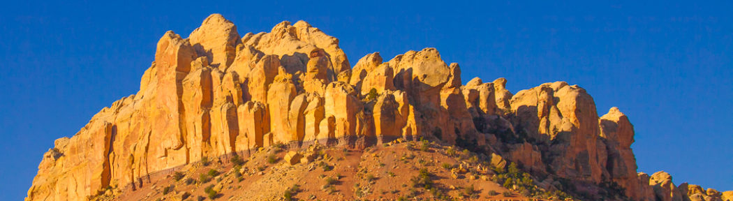
Columbia gorge

Columbia gorge

There are the usual logistical issues of where to stay so that we can maximize photo time and have the greatest possibilities.  Then there is the question of what places should we plan on stopping at?  In this case, a guided book is invaluable, and I like Photographing Oregon, the whole ‘Photographing <state>’ series is designed for photographers.  But, beyond the logistics of the trip there are other challenges that should at least be given some consideration.  In sunny California, water, and in particular waterfalls are not common, blue skies are.  How should we shoot a waterfall? High noon doesn’t work!   Waterfalls are difficult to shoot because of the high contrast between the water, shade and sky.  The high contrast makes it difficult to capture an image that matches the experience of the waterfall.

There are several ways to deal with the high contrast so often found when shooting waterfalls;

  • Make sure that everything in the photo is in the shade (implies no sky).  The picture below violates sky clause, however most of the photo is in the shade , but even then the contrast in the water is still large.
    waterfall in the shade

    Silver Falls Park, OR

    This usually means knowing the right time of day for each scene that you want to shoot. (not 2PM like this one)

  • Do not include the sky even if there is direct sun on the scene
    Can require great creativity in composition to make this work.

    waterfall, no sky

    San Jose, Uvas Canyon

    Waterfall without sky

    Waterfall without sky

    Waterfall with sky

    Waterfall with sky

  • Use HDR with bracketed exposures (Usually need 3 to 5 stops on a sunny day)PL20100412-Waterfalls-4519
  • Shoot with overcast skies so that the light is more even, less contrasty, and the colors are richer
    Although I like HDR for the increased range, I have not yet had great success with waterfalls when I include the sky.

    Overcast, rainy day waterfall

    Multnoma, Columbia gorge

I couldn’t resist using this picture of my wife and I. Multnomah falls is a popular wedding location. 🙂 Luckily the Oregon weather tends to cooperate with this aspect!

11. July 2015 · Comments Off on Cropping – The Big Win · Categories: Composition, processing photos · Tags: , ,
Before Cropping

Before Cropping

Cropping is usually the single biggest impact operation on a photo to improve it, though not always.  The general rule is do biggest impact global changes first, and local changes later.  Sometimes exposure may trump cropping.  In the leading image it is a toss up as to whether cropping or exposure needs to be address first.  Below are a set of samples that show different types of cropping and exposure changes that lead to the finished image.

As can be seen it looks interesting but it is over exposed and the surfer is up in the corner. How can cropping help this?

Adobe’s Lightroom(LR), has several built in guides that represent classic composition guidelines.  These include:

  • Rule of Thirds
  • Diagonals
  • Magic Triangles (my name)
  • Golden Mean (modified thirds)
  • Golden Spiral
Before Cropping w/ exposure corrected

Before Cropping w/ exposure corrected

These overlays are helpful guides to use when trying out various crops on a photo.  Below are examples of the crops. Before cropping, I made some exposure changes to make the photo easier to work with as seen here. The guides should have the guide lines match lines in the photo and have guide line intersections at points of interest in the photo.

Now there is a little more definition in the shape of the wave, and we can see that it makes a nice leading line as well as framing the surfer.  Its just not at an interesting place in the photo, so we try cropping it  to make it look better.  Notice the sliders over on the right that were diddled with; Exposure, Contrast, Highlights, Whites to improve the appearance.

One take on cropping on a third

One take on cropping on a third

Below is a first guess at using the rule of thirds for cropping. The surfer’s eyes are on a third line and so is his body.  But, the nice line of the wave is lost.

So, a second possible crop with thirds is cropping more off the bottom to bring the bottom third line up.  This looks interesting, the surfer’s expression is great, but I want more wave not less.

A second take of cropping on a third

A second take of cropping on a third


So, let’s try a third time with rule of thirds.  This is better from my aesthetic because there is more wave in the photo with the nice lines.  This is starting to work.


Third take on cropping on a third

Third take on cropping on a third


So, let’s check it out with some of the other guides and see how it lines up…

Cropping with the Magic triangle guide

Cropping with the Magic triangle guide

Cropping on the diagonals

Cropping on the diagonals

This shows the the diagonal cropping guides. Notice that they place the surfer at the center, and approximately match the leading line of the wave, all pluses.

Checking out the magic triangle cropping (below) shows that the guides also line up with the image. I like magic triangles, and in this case they work nicely as well
Often, when you have a good crop, the guides will all agree on the crop. And it will be visually pleasing.

For more images visit my website.

08. July 2015 · Comments Off on ‘…Lightroom is not difficult’, but …. · Categories: Composition, How to, processing photos · Tags: ,

PL20050430-Hakone-Gardens-2819I came across a blog posting to the affect that Lightroom was not difficult to use.  The title got me to thinking, that it is correct in so far as it goes, but there are things that are difficult.  First off, for those who don’t know, Lightroom (LR) is an Adobe application for photographers to work with photos.  It has a number of capabilities that meet the needs of different folks.  Adobe has done a pretty good job of making the program user friendly and powerful.  Although, by name, Adobe’s Photoshop sounds like it is for photos, it is really a graphic artist’s tool for a power user, and is difficult to learn to use well.  Lightroom by contrast is much easier to learn, and generally photographers are much more productive using Lightroom than Photoshop.  There are still a few things that Photoshop is better for, although that shrinks with each release of Lightroom.

So, what then is difficult in working with a photo, if Lightroom is not difficult?  This is the question that I started pondering when I saw the post title.  Think of the various Lightroom courses that I have taught, what was the area(s) that cause folks the most problem(s)?  It wasn’t the mechanical manipulation, or the use of the various Lightroom features, it was rather trying to determine what needed to be done to a photo to improve it.  This was the most common problem, and the most difficult for students to learn.  The student questions were often ‘I like this photo, what do I need to do to improve it?’  There are a lot of ways to answer this question, and it should be answered from at least several directions.

Humming Bird

Humming Bird

  • How does someone develop a better ‘eye’ so that they can know what needs to be done to a photo?
  • What needs to be done with this specific photo?
  • How do I do something with this specific photo?
  • Are there any rules of thumb that I can use for guidance when working with a photo?

Each of these is important at least in honoring the student’s process of inquiry. Part of the difficulty is that there are so many answers that trying to hold all of them as a gestalt takes time.  Let’s take each of these in turn.


Humming Bird

Humming Bird


  1. Before Lightroom

    Before Lightroom

    How to develop a better eye?

    1. Look at pictures in magazines (particularly for people shots), and identify what works in the picture,
      After Lightroom

      Waking grizzly

      and what does not in terms of catching your eye, or why you like it.

    2. Join a site like 500Px and write reviews of photos.  This will force you to think about what works and does not work in each photo.  If you write 100 reviews, your photos will become much better.  Writing a 100 reviews is surprisingly difficult in terms of emotional effort.
    3. Look at your own photos (Lightroom is great for this), and decide what works to make one photo more desirable than another.
  2. What needs to be done to a specific photo?  I like it, but feel it should be stronger. What are the rules of thumb to improve the photo?

    1. Oak barrels in vault

      Oak barrels in vault

      I have combined two of the above because I don’t have ‘the photo’ in front of me to comment on.

    2. General Rules of Thumb
      Oak barrels in vault

      Oak barrels in vault

      1. Work from the biggest things to the smallest things. From global for the whole picture to specific parts of the picture
        1. Usually this is cropping and straightening the photo.  Lightroom has some hints about how to crop and will auto rotate the photo a bit if you want it to.  Using the built in guides in LR to find thirds, or golden mean, or spiral is very helpful and usually makes a significant improvement in any photo.
        2. Sometimes correcting the color or the exposure  takes precedence over cropping, but whether first or second getting the exposure correct and the color balance correct also make big improvements in the photo.  I suggest using ‘Auto’ for the color balance if you are a newbe until you have a better understanding.  Although there is an exposure slider, try sliding the highlights and shadow sliders to achieve what you want.  If you need bigger guns try the black and white sliders.
        3. Try adding some Clarity slider, and some Vibrance slider to the photo to taste (kind of like salt and pepper).
      2. For specific areas in the photo
        1. Get rid of the spots in the photo, LR has a great tool for this with the spot remover.  Try checking the box at the bottom of the photo, after the spotting tool is selected in the Develop Module.
        2. How are the faces of the people in your photos? Are they slightly dark, do they convey the right mood? In particular how are the eyes and eye sockets?  LR has a ‘Radial Filter, that does wonders with faces and eyes.  It take a few minutes to learn, but easy to use after learning.  It can lighten faces and eyes, and bring the attention to faces.   One of the things that you may have noticed from looking at lots of pictures is that the faces are almost always intentionally lit.
        3. Is the sky washed out, does it need to be a bit bluer?  There is a gradient filter that will help with this, very easy to use.
    3. Finally, use LR to create a virtual copy or clone of the photo you have been working on and reset it to original and compare the edited results with the original.  If you don’t like the results, do it again, although I have found that this is fairly rare.
  3. How do I do something with this photo?

    1. Although this sounds somewhat like ‘what are the rules of thumb’ I am treating this slightly differently to deal with the mechanics of using Lightroom.
    2. There are hundreds of tutorials online, usually as short videos that make it very easy and quick to use Lightroom.   Lightroom is not a difficult program to master (unlike Photoshop).   There are courses offered at camera stores, by camera clubs, and by friends.  If you are interested there is a way.

Scattered throughout this post are before and after images.  Visit  my website to see more images.

30. June 2015 · Comments Off on Composition – Framing – no not the wood around the photo · Categories: Composition, Practice · Tags: , , , ,

“Art is the imposing of a pattern on experience, and our aesthetic enjoyment is recognition of the pattern. “

Alfred North Whitehead

Dancing Trees

There are several composition topics in photography that are most easily learned through examples rather than prose.  I thought I would write a series of articles on several of these with a few photos in each to help illustrate the point.

I’m starting with framing because it was one of the easier ones to start with, not because it is more or less important, but just easier for me to write about.

One way to look at framing is that the subject around the edge draws your attention to the main focus point.  I would encourage you to log onto 500px.com and see what you can identify as successfully framed photos.

Laurie in Little Wild Horse slot canyon

It could be reasonably argued that the above photo is really about lines, but notice how we have both lines and color framing my wife.

The photo below is an example of classical framing.CRW_0598You probably recognize this type of framing from travel post cards.

For the opening photo, notice how the branches frame the moon.   This would not have been as effective if the branch split the moon.  This also illustrates that not all framing needs to symmetrical in position or content.

Early morning light catching the spray from a waterfall

This photo illustrates a classic concept involved with framing; that is that the borders or the frame is darker than the central point of focus.  Eyes are typically drawn to the bright parts of the photo.

_MG_0629_30_31-2

In this example, the bright trees frame the waterfall which is itself framed by the dark rock.  This photo illustrates again that framing does not need to be symmetrical, nor even conventional with bright being the framing of the waterfall.

_MG_2926-_MG_2928_PA

This photo is again asymmetrical framing, this time of El Capitan framed with trees.

The challenge to you is to experiment with framing in your photos and decide what works and does not work for your photos.

“If you see a whole thing – it seems that it’s always beautiful. Planets, lives… But up close a world’s all dirt and rocks. And day to day, life’s a hard job, you get tired, you lose the pattern.”   Ursula K. Le Guin

Check out other images for framing or the lack there of… on my website

15. April 2015 · Comments Off on A stronger Picture · Categories: Composition · Tags:
The Bridge

The Bridge

Go to the truth beyond the bridge- Patrick Lynch

Once again, I have fallen prey to the belief that a ‘new’ camera/toy will make better pictures !   While it is true that the quality of these images is beyond comparison to the point and shoot.  I have not been struck  wonderful as the worlds best photographer.

Being a good photographer is beyond the camera, and is also in the eye of seeing the photo.  What does that mean, the ‘eye of the photographer’ ?  There are several things that go into developing the ‘eye of the photographer’.

  • Recognizing the emotional appeal of a photo or a scene.  Or you can think of this as seeing the beauty of a scene
  • Technical craft: turning the camera  on, holding the camera still (usually),  getting the right exposure
  • Thinking about what makes  the picture the strongest picture possible. This includes composition, deciding if you want the distance to be blurred or sharp and choosing the picture you want.

Here Is another image, not as strong;

Different angle on the bridge - developing the eye of the photographer

Different angle on the bridge – developing the eye of the photographer

The top image could be made stronger by taking out the telephone pole and line which are distracting.


Part of the learning the craft, is to go beyond recognizing what would make a nice photo (the bridge) but also how to make it the strongest statement as possible. In this case, I was having to contend with cars, changing fog bank, no visibility to traffic.

In this case, being in the center of the road leads to a rather static feeling photo, whereas on the edge, there are diagonal lines which liven the photo. Having practice enough there wasn’t conscious thinking, but rather just knew, felt, intuited that the diagonals inherent in taking the photo from the side would make it more appealing.

What can you do to go beyond the recognition of a scene, to making it a stronger picture?

What I have found that works very well for anyone, novice through expert is looking at someone else’s photos (get rid of the ego – all my photos are good) and having to give useful reviews.  I particularly like  PhotoSig for this. It is free or pay (pay you can post more of your own photos).  People post photos, and other people who want can write reviews (very good practice), and the remainder of us can rate both the photos and the reviews.  Writing reviews that others find helpful forces you to examine the photo and give gentle feedback, which is the skill we need to learn for ourselves.